



soteri skin improved email design without losing clinical credibility
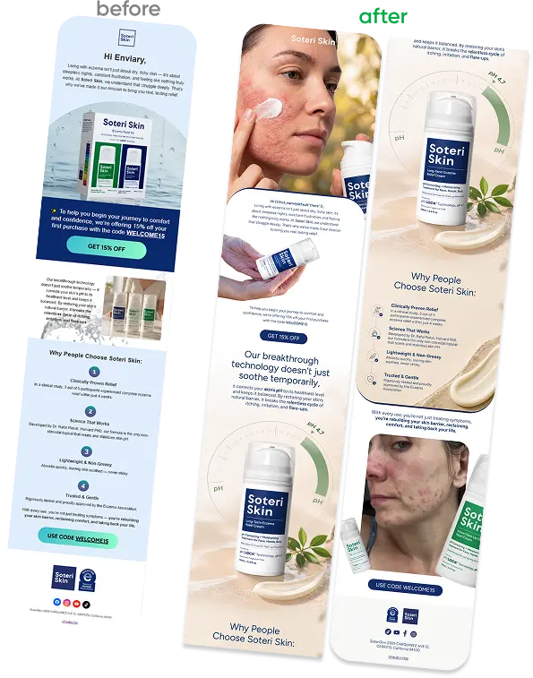
Soteri Skin had email templates that looked broken on most clients, misaligned blocks, inconsistent type, no visual hierarchy. fixing the design risked burying the message that actually built trust: the science. the rebuild had to look premium and stay legible as a clinical claim, not just a pretty layout.
click rate after redesign
+
0
%

- Verified Outcome
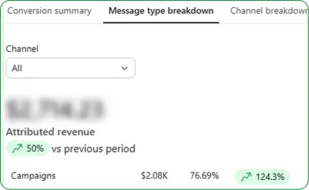
campaign revenue increase
0
%
THE PROBLEM
a clinical brand with a template that did not hold together
templates rendered correctly on desktop but broke on mobile across most clients.
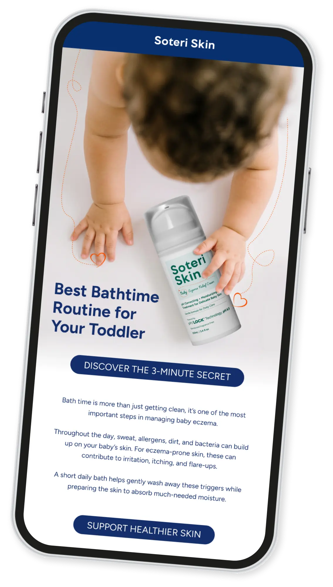
weak type hierarchy made headlines, body copy, and CTAs compete for attention.
clinical credibility cues were buried below decorative content instead of leading the message.
WHAT ENVIARY CHANGED
rebuilt the template system around hierarchy first, decoration second
What we built
- Simplified the color and layout system so the brand looked premium
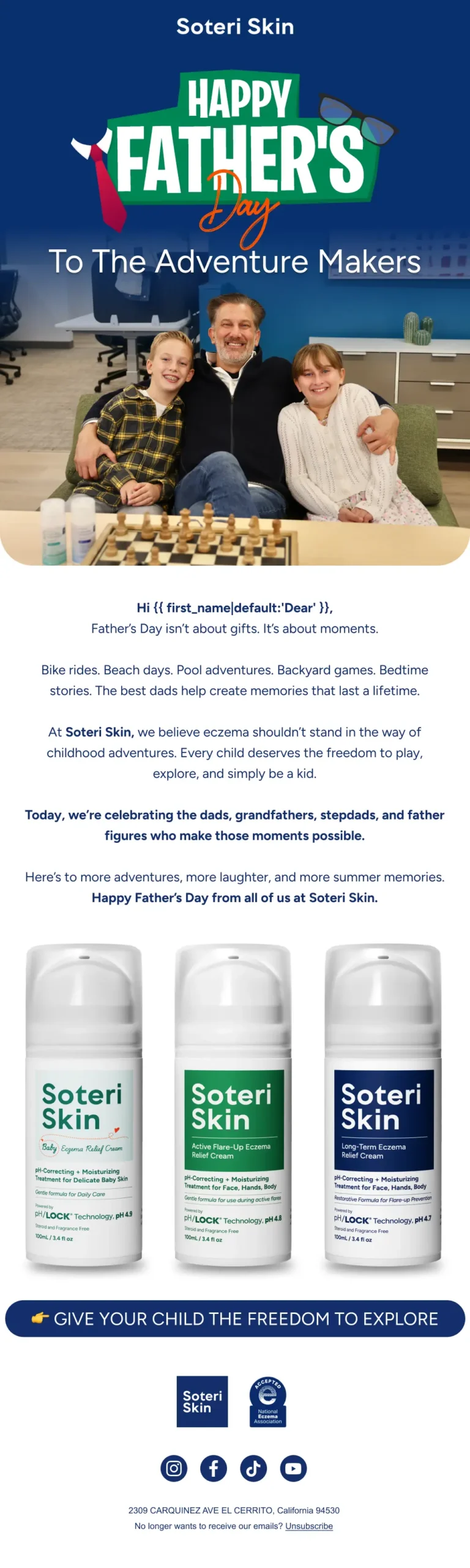
- Used a single-column, mobile-safe structure across every template.
- Standardized headline, body, and CTA styles for consistency.
- Prioritized clinical proof points above decorative visuals.
pre-agency
0
%
Email attributed revenue
after working with enviary
0
%
Email attributed revenue
THE RESULT
premium design, same commercial clarity
click rate increase
+
0
%
Attributed revenue increase
+
0
%
campaign revenue increase
0
%
clinical design with commercial hierarchy
Aesthetics that convert


Results Snapshot
measurable growth through improved email design
WHY IT WORKED
design had to earn trust, not just attention
The goal was not to make it prettier. It was to make the brand feel as clinical as its products, while keeping the click path clear. Once the hierarchy was fixed, the science and dermatologist backing finally had space to lead.